A promotional mug can generate thousands of brand impressions during its lifetime—but only if people can actually see your logo. Choosing the wrong placement can reduce visibility, distort your artwork, and waste your marketing budget.
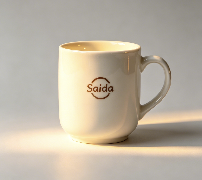
The best logo placement for promotional coffee mugs depends on three factors: your audience (the drinker or observers), the mug's physical shape, and your chosen printing method. For maximum public brand exposure, place the logo opposite the handle. For a more personal connection with the user, place it facing the drinker. The shape and printing technique will ultimately define the safe and effective printable area.
Now that you know the answer isn't a simple spot on a diagram, you're already thinking like a pro. This shift in perspective is crucial for avoiding costly mistakes. Let's dive deeper into the framework I use to guide our clients through this decision-making process every day.
Who is the Logo For: The Drinker or the Observer?
You want your logo to get noticed, but who are you trying to get noticed by? This is the first question I always ask my clients. Placing the logo in the wrong position means it could be completely hidden during its most common use cases, defeating the purpose of the promotion entirely. Let’s break down the strategic choice between an inward or outward-facing design.
The most effective placement depends entirely on your primary goal. For broad brand awareness in a public setting like an office or a trade show, the logo should face outward. For creating a personal, daily connection with the user, like an employee gift, the logo should face the drinker.
H3: The Outward-Facing Logo (Observer's View)
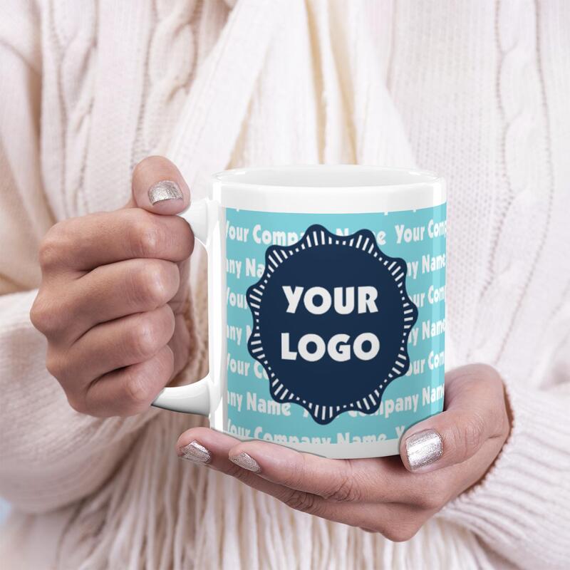
This is the most common choice for promotional giveaways, corporate events, and café mugs. The logo is placed directly opposite the handle. When a right-handed person holds the mug, the logo faces away from them, visible to everyone else in the room.
- Primary Use Case: Maximum brand exposure in social or professional settings. Think of a desk mug in an open-plan office or a mug used in a client meeting. The goal is for others to see your brand.
- The Righty/Lefty Dilemma: The standard placement assumes a right-handed user. If a left-handed person uses the mug, this "outward-facing" logo now faces them. For general giveaways, a right-handed majority is a safe assumption. However, if you know your audience has a high percentage of left-handers, you might consider printing on both sides.
- From a Production Standpoint: This is often called "Position 1" or "Side A." It's a straightforward, cost-effective placement that works well with nearly all printing methods. It’s a safe bet for large-volume orders.
H3: The Inward-Facing Logo (Drinker's View)
Here, the logo is placed on the same side as the handle, so it faces the person drinking. For a right-handed user, the logo would be to the right of the handle.
- Primary Use Case: Creating a personal connection with the user. This is excellent for internal company gifts, high-value client presents, or merchandise for a loyal fanbase. The message is for the owner of the mug, reinforcing their connection to the brand with every sip.
- Personal Anecdote: I once worked with a software company that was giving mugs to its developers as an appreciation gift. We chose an inward-facing placement for a small, clever line of code. The public wouldn't get it, but it made the developers smile every morning. It was for them, and that made it effective.
- Production Note: This is often called "Position 2" or "Side B." The cost and process are identical to the outward-facing placement.
H3: Double-Sided Printing: The Best of Both Worlds
Why not do both? Placing a logo on both sides of the mug ensures visibility no matter how it's held. This is the ultimate solution for covering all bases.
- Best For: Maximizing impressions when you can't predict the use case or user. It's also a great way to display two different things—perhaps a logo on one side and a slogan or website on the other.
- The Trade-Off: This option costs more. You are essentially paying for a second print on every mug. As a factory, we calculate this based on the additional labor and ink required. For wholesalers and e-commerce sellers, you must factor this into your unit cost and final sale price.
How Does Mug Shape Affect Logo Placement for Promotional Coffee Mugs?
You've found a uniquely shaped mug that you love—maybe it's tapered, curved, or has a belly. The problem is that these interesting shapes create major challenges for printing. A logo that looks perfect on your screen can become a warped, unprofessional mess on a curved surface. Understanding the "true printable area" is the key to avoiding this.
The shape of the mug directly dictates the safe, flat printable area. Standard cylindrical mugs offer the most flexibility and largest print area. In contrast, tapered, barrel, or other curved mugs have specific constraints that can distort a logo if it's not sized and placed carefully within the flattest part of the surface.
H3: The Classic Cylinder: The Safest Bet
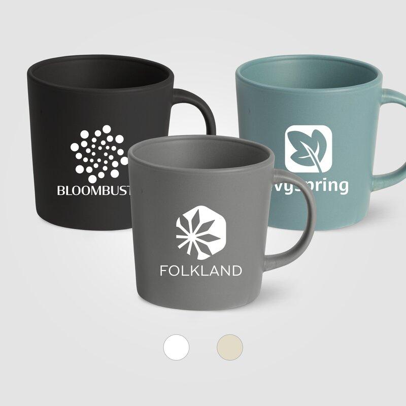
The standard, straight-walled cylindrical mug is the most popular choice for promotional products for a reason: it's a manufacturer's dream. The surface is consistent and flat (when unrolled), providing a large, predictable canvas.
- Printable Area: Large and rectangular. You have maximum freedom for placing large logos, detailed text, or even full-wrap designs.
- Distortion Risk: Extremely low. As long as the artwork is prepared correctly, what you see in the digital proof is what you'll get on the finished mug.
- My Advice to Clients: If you are new to sourcing promotional mugs, have a complex logo, or are placing a very large order, I almost always recommend starting with a classic cylinder. It removes a major variable and reduces the risk of costly errors.
H3: Tapered and Bell Mugs: The Distortion Risk
Tapered mugs, which are wider at the top than the bottom (or vice-versa), introduce a conical shape. Printing a flat, rectangular logo onto this surface will cause it to curve and distort, an effect known as "keystoning."
- The Challenge: The logo appears to smile or frown. A square logo will look like a trapezoid. This can cheapen your brand's appearance instantly.
- The Solution: From a production standpoint, we have two options. First, we can print a smaller logo and place it carefully in the middle of the mug wall where the curvature is least pronounced. Second, for more complex prints, the artwork itself must be pre-distorted (given a slight arc) to counteract the mug's shape. This requires more design expertise and precise setup.
- What to Watch For: Always, always request a physical sample or a very precise digital mock-up that shows how the logo will sit on the curve. Don't approve a job based on a flat graphic.
H3: Barrel and Rounded Mugs: Vertical and Horizontal Curves
Mugs with a rounded or "barrel" shape present a compound curve—they curve both horizontally around the mug and vertically from top to bottom. This is the most challenging shape for logo placement.
- The Challenge: A logo can appear "pincushioned" or bloated in the middle. The print area is often a small, oval-like sweet spot in the center.
- Printing Limitations: Screen printing is particularly difficult on these shapes. Decal printing (which we'll cover next) is often required, as the flexible decal can conform to the curve more effectively before being fired.
- Risk Management: For these mugs, smaller and simpler is better. Think of a circular emblem or a simple wordmark rather than a large, rectangular block of text and imagery.
| Mug Shape | Printable Area | Distortion Risk | Best For |
|---|---|---|---|
| Cylinder | Large, Rectangular | Low | Complex logos, full wraps, beginners |
| Tapered | Limited, Conical | High | Simple logos, pre-distorted artwork |
| Barrel/Rounded | Small, Oval | Very High | Small emblems, requires decal printing |
How Does Printing Method Limit Your Placement Options?
You have a perfect design and you know exactly where you want to put it. But you might be surprised to learn that the printing method you choose may not even allow it. This is a critical piece of information that many buyers overlook. The two most common methods, screen printing and decal printing, have very different capabilities and constraints.
Screen printing is a direct-to-surface method that is fast and cost-effective for simple designs, but it cannot print too close to the handle, rim, or base. Decal printing uses a transferable sheet, allowing for full-color, complex designs and more versatile placements—including full wraps and inside prints—but at a higher unit cost.
H3: Screen Printing: Speed and Simplicity
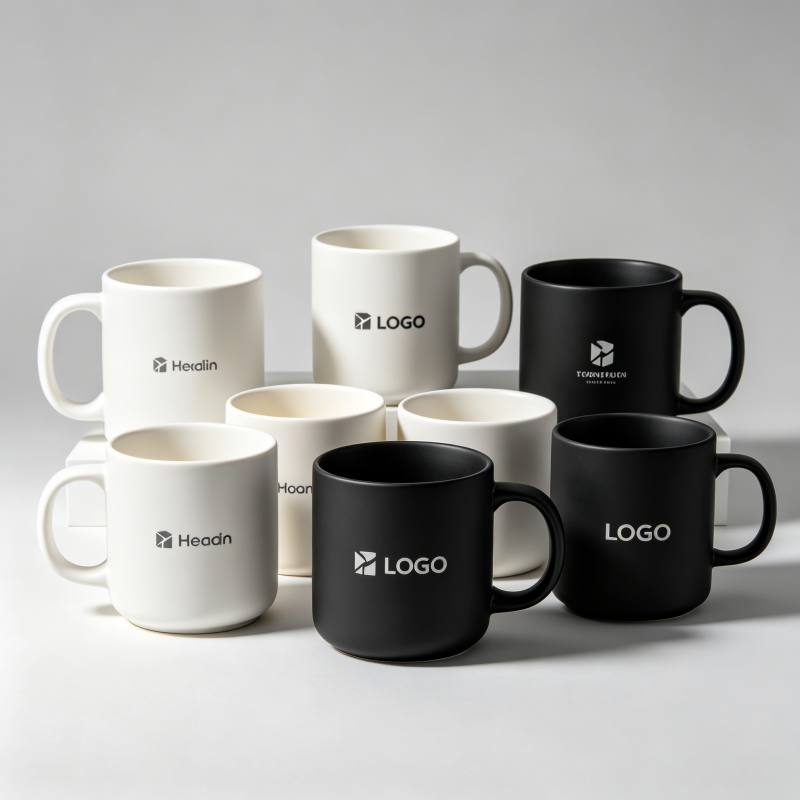
Screen printing (or silk screening) is a workhorse in our factory. The process involves pressing ink through a fine mesh screen stencil directly onto the mug's surface. Each color requires a separate screen and pass.
- How it Works: A machine holds the mug and rotates it as a squeegee pushes ink through the screen. This physical process is what creates the limitations.
- Placement Restrictions: The most significant restriction is the "dead zone" around the handle. The printing apparatus simply cannot get close enough, typically leaving a gap of 0.5 to 1 inch on either side of the handle. There are also small gaps required at the very top and bottom of the mug.
- Best For: Simple, solid-color logos (usually 1-3 colors). It is extremely cost-effective for high-volume orders, making it the go-to for many large-scale promotions. The print is thick, vibrant, and durable.
- The Trade-Off: You sacrifice placement flexibility and color complexity for speed and a lower cost per unit. Full-wrap designs are not possible with this method; the best you can get is a "panoramic" print that leaves a large gap at the handle.
H3: Decal Printing: Precision and Versatility
Decal printing is a more artisanal, multi-step process. Your design is first printed onto special decal paper with ceramic inks. This decal is then carefully applied to the mug by hand, smoothed out, and the mug is fired in a kiln at a high temperature. The heat burns away the paper and fuses the ceramic ink permanently to the mug's glaze.
- How it Works: Because the decal is a flexible sheet applied by a person, it can be placed almost anywhere. It can wrap around the handle, go right up to the rim, sit on the inside of the mug, or even be placed on the bottom.
- Placement Advantages: This method is required for full-wrap logos, photographic images, gradients, and designs with many colors. The precision is unmatched.
- The Trade-Off: Decal printing is more labor-intensive and time-consuming, which makes it more expensive per unit. For full wraps, there is always a seam where the two ends of the decal meet. While we take great care to make this as invisible as possible, a slight line or pattern mismatch can occur, especially on complex designs.
| Feature | Screen Printing | Decal Printing |
|---|---|---|
| Cost | Lower | Higher |
| Color Complexity | Best for 1-3 solid colors | Unlimited colors, gradients, photos |
| Placement | Restricted (gaps near handle) | Highly flexible (full wraps, inside) |
| Durability | Very High | Very High (when fired properly) |
| Turnaround | Faster | Slower |
| Best For | Bulk orders, simple logos | Premium designs, complex shapes |
Frequently Asked Questions
What is the standard printable area on a coffee mug?
There is no universal standard, as it depends entirely on the mug's size, shape, and the printing method. However, for a typical 11oz cylindrical mug using screen printing, the printable area is usually a rectangle around 8.5 inches wide by 3 inches tall, positioned to leave space around the handle.
Can you print a logo on the bottom of a mug?
Yes, this is possible using decal printing. It's a great spot for secondary information like a website URL, a "Made in..." stamp, or care instructions. It adds a premium touch but does increase the cost per unit due to the extra application step. Screen printing cannot be used on the bottom.
Is a full-wrap logo a good idea?
A full-wrap logo can be incredibly impactful and visually stunning, but it has trade-offs. It requires the more expensive decal printing method and carries a slight risk of a visible seam where the decal ends meet. It works best for seamless patterns or landscape-style images rather than designs where a perfect edge-to-edge match is critical.
How much does logo placement affect the price?
A standard, one-sided print (either inward or outward-facing) is the baseline price. Adding a second print on the other side will increase the cost. More complex placements like full wraps, handle prints, or bottom prints cost even more because they require the more expensive decal process and additional manual labor.
Conclusion
Ultimately, choosing the best logo placement for promotional coffee mugs is not about finding one right answer, but about running through a strategic checklist. By considering your audience, the physical realities of the mug's shape, and the capabilities of different printing methods, you move from guessing to making an informed business decision. The ideal placement is one that maximizes your brand's visibility and impact while managing production risks and staying within your budget. It's a balance of art and manufacturing science.
After manufacturing millions of ceramic mugs for retailers, promotional companies, and coffee brands across Europe and North America, we've learned that logo placement is one of the biggest factors affecting customer satisfaction.
As a ceramic mug factory with 15 years of export experience, we help wholesalers and e-commerce sellers in Europe, North America, and South America navigate these decisions every day. If you're ready to create promotional mugs that get your brand noticed for all the right reasons, contact us for a consultation. We’ll guide you through the process to ensure a perfect, professional result for your next bulk order.